NEW WESTMINSTER CITY HALL
New Westminster’s City Hall—designed in the emerging Modernist style of the early 1950s—was in need of a signage refresh. While the building retained it’s original simple strong lines, changes over time resulted in a cluttered and disorganized approach to wayfinding. Our team came on board to develop a wayfinding program that centered visitor experience while also respecting the architectural features that gave the building unique character.
Client: City of New Westminster
Location: New Westminster, BC
Scope: Wayfinding strategy, signage design


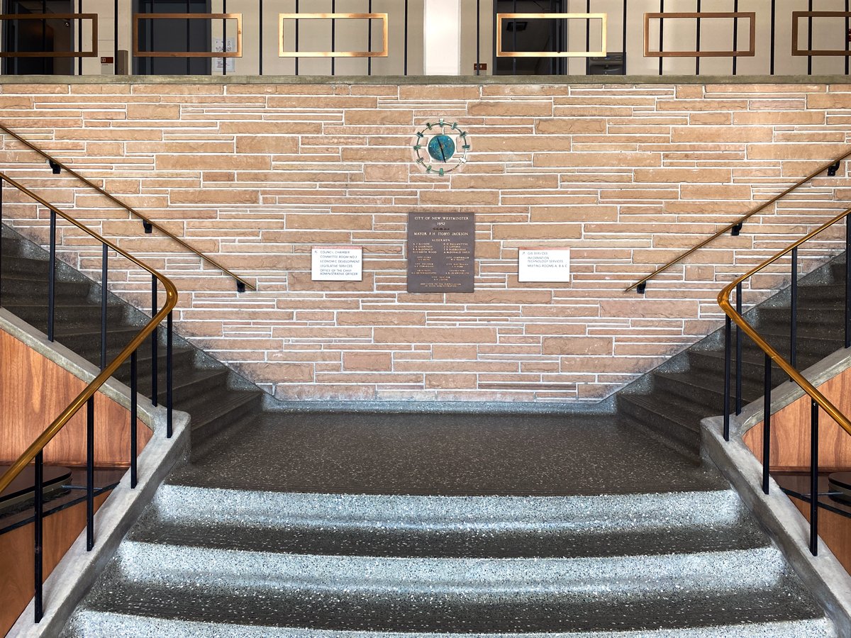

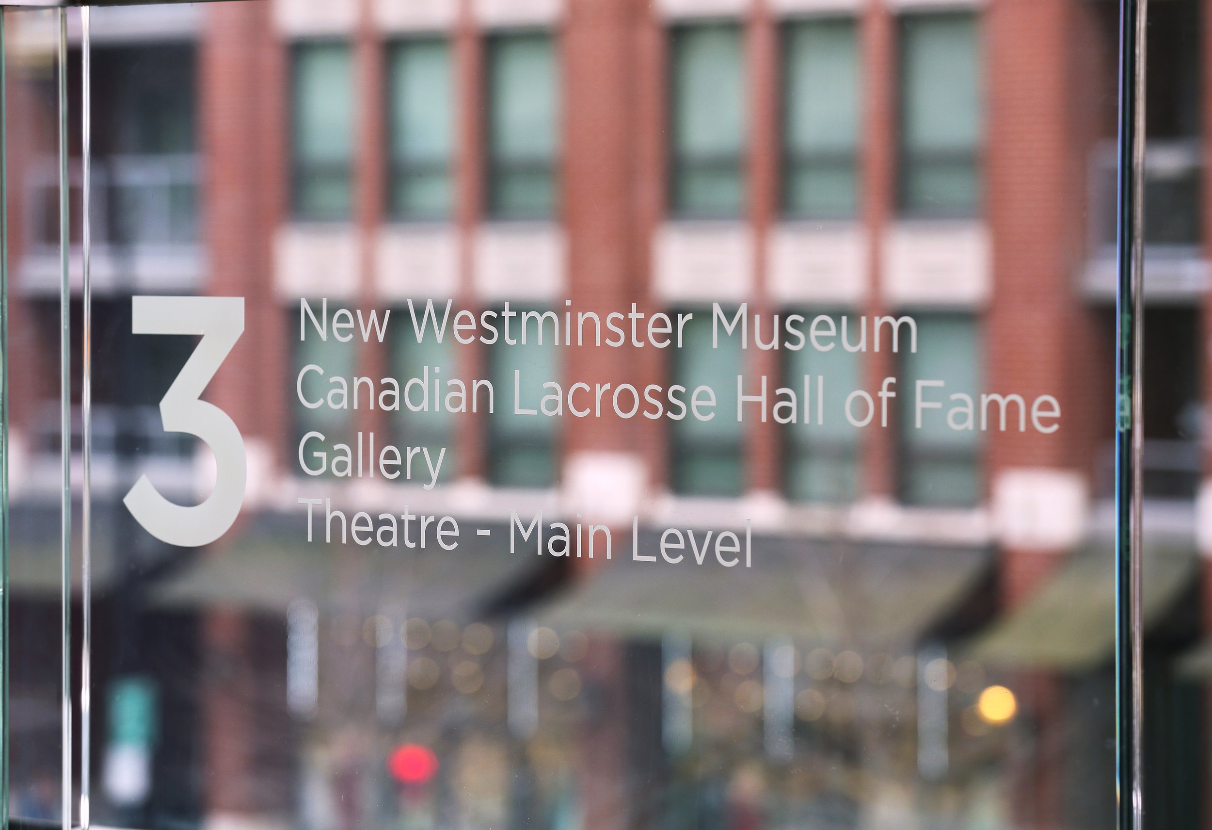
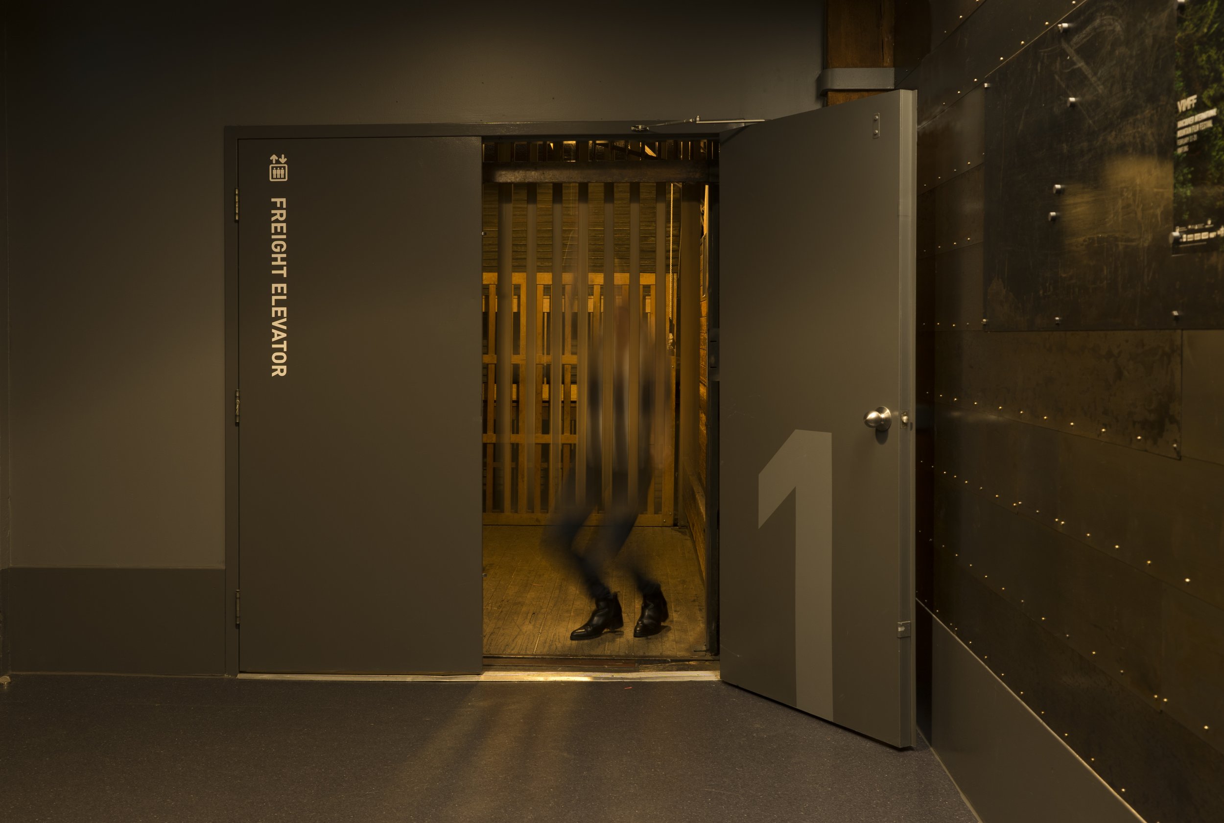
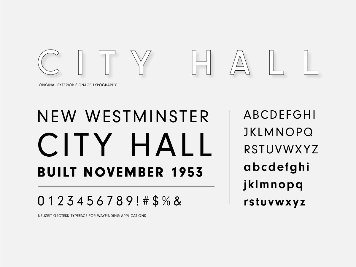
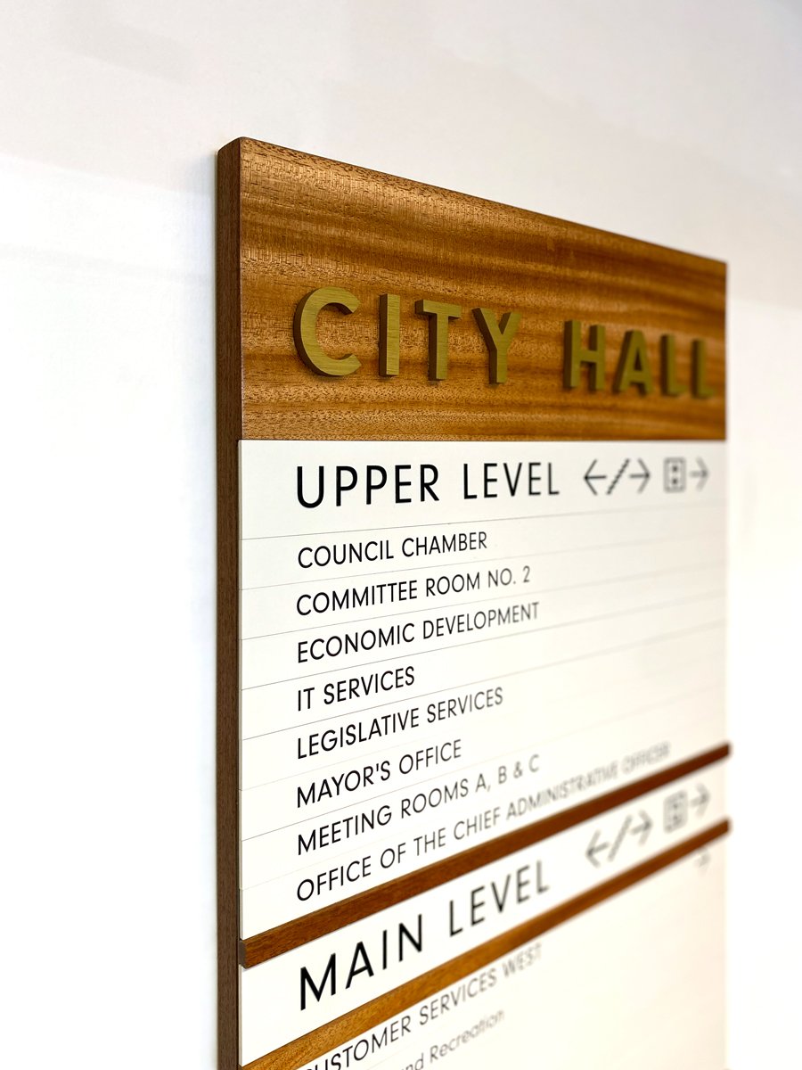
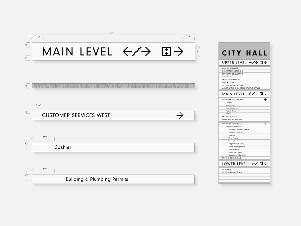
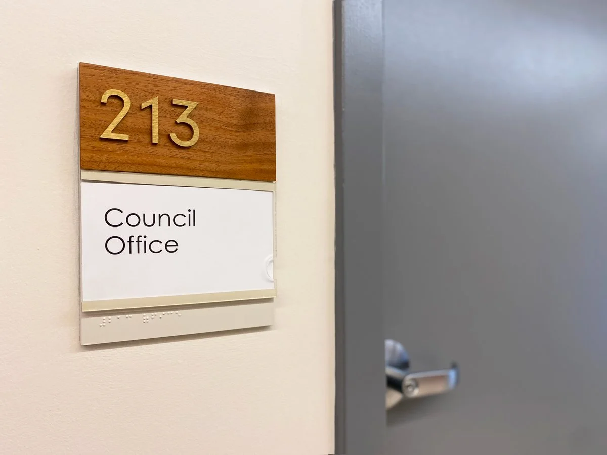
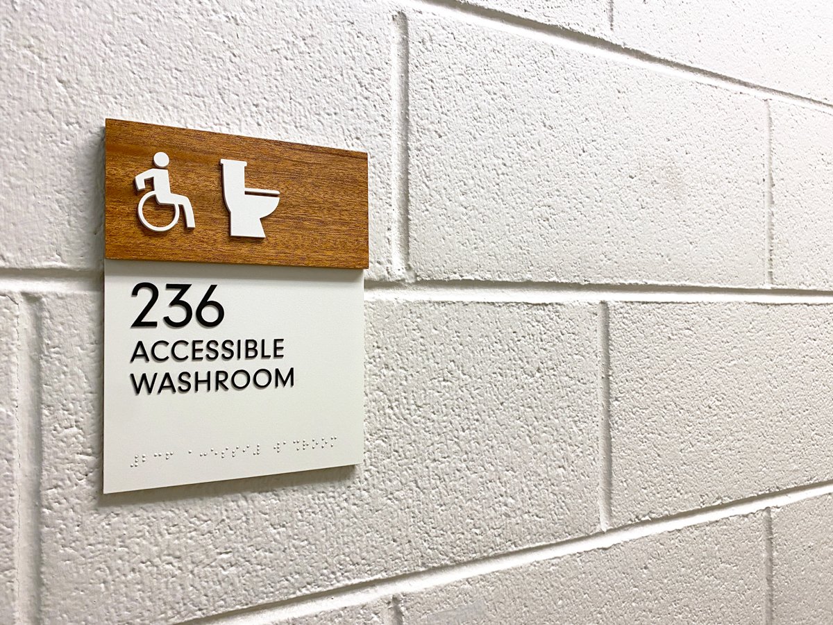
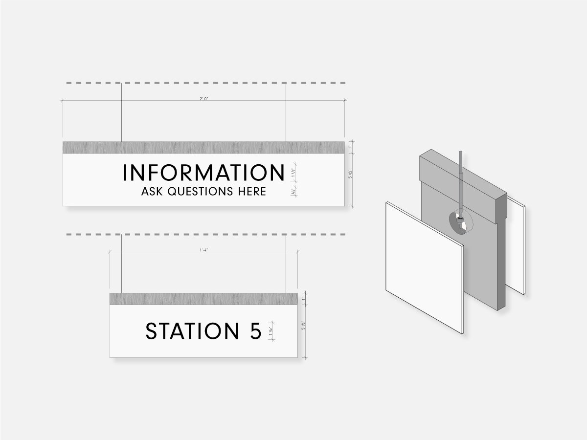
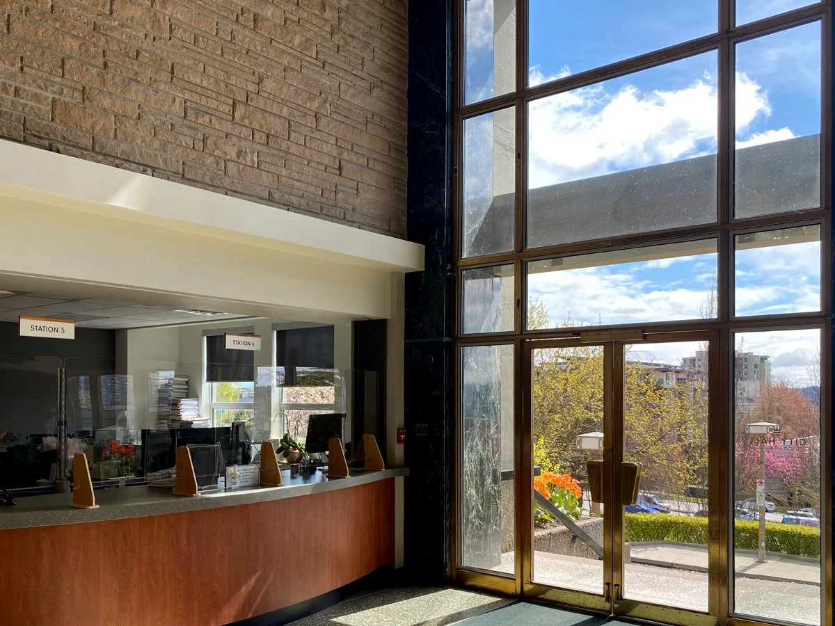
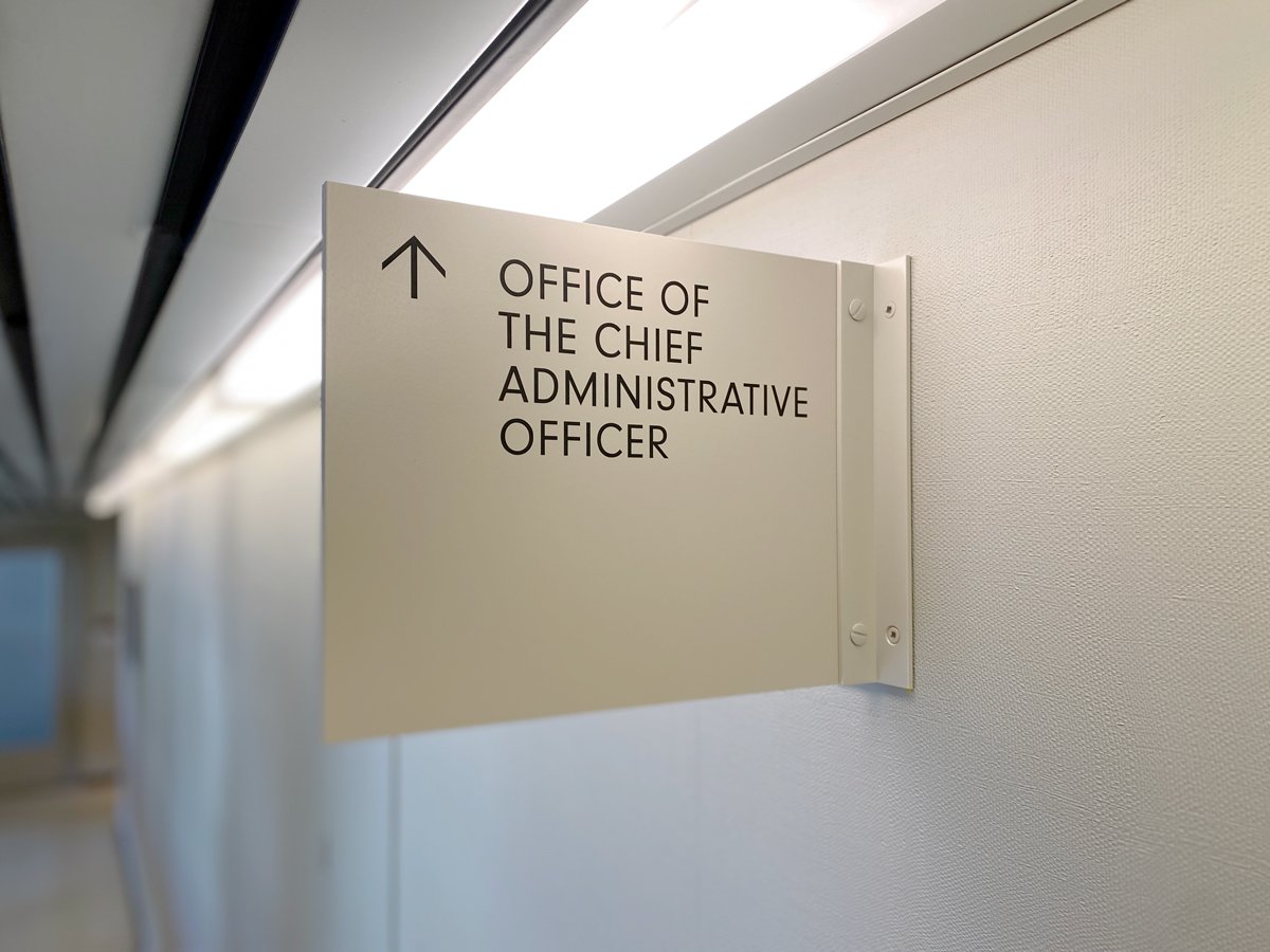
The atrium is the central location for visitors using City Hall services and the signage had to be clear, informative and well integrated. Signage with high contrast typography and consistent hanging height and locations guarantee easier user navigation. Throughout the building the signage design drew on historical features of the architecture like honey toned wood veneer and brass metal details. Mid-century sans-serif typography references the original exterior signage making a consistent experience throughout. A limited colour and material palette, as well as updated features like braille and dimensional text, ensure that the signage system will useful for years to come.





Similar Projects


